LaDainian Tomlinson MySpace Layout
Intoduction:
Learn how to create a MySpace Layout, as the preview below shows:

Step 1: The Setup
First things first, we will have to decide what we want our myspace page to look like. Border colors, text colors etc.
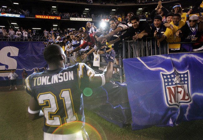
I find it easier to get a picture that you want, and then use the colors within that picture for everything else. We don’t want a model on a sunny beach, with a red and orange bikini, and then throw shades of green for the borders and text – unless that’s your kind of thing. I have chosen this picture the San Diego Running Back, LaDainian Tomlinson. For this MySpace layout, we will be making 3 different pieces. The background, contact table, and extended network piece. Personally, I think it is best to have 3 different pictures for each piece that we are making. Although, in the end, the decision is entirely yours, so do what you like the best.
Step 2: The Cuts
Depending on where you get your stock photo or renders from, you may need to cut (or extract) the thing you want from its background. Ill sort of give you a brief walkthrough on how to do this. If you’re comfortable with this step, or don’t need to cut anything out, feel free to skip to step 3.
First, we will be using the Pen Tool to make our outline. Second, zoom in closer so you can see what you are doing better. Probably the three most important skills for this step are precision, patience, and of course zoom. For the most part, cutting things out is easy. The hardest part about this is when you reach the hair. Nice, flowing hair will give you the most problems, almost every time. Ill admit, im not the best at extracting hair, but as long as you do the three things I advised above, you will be able to get it after a few tries.
Alright, enough of this introduction. Zoom in on your target a bit so you can see fine. With your pen tool, just follow along the edge, with short spacing. Even in a long, which appears to be a strait line, its always better to follow it in fragments instead of one large line. Now after you complete your outline, right click, and do ‘make selection’. Then copy your selection (CTRL+C) and then paste it into your background document (CTRL+P).
Step 3: The Background
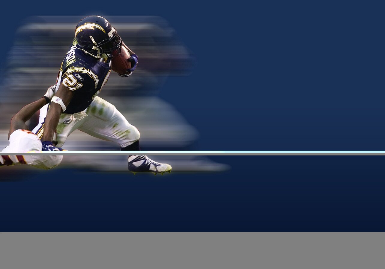
So for the background image, create a New Document, 1284×900 pixels.
Get your Gradient Tool, set your Foreground Color to #081735, and your Background Color to #193056. Then start your gradient at the top of the canvas, and drag it all the way down while holding shift to keep it strait.
Paste the image you want to use for the background image onto the canvas. Depending on the size of your stock, you might have to do some adjustments. Press CTRL+T to enter your transform mode. Then, while holding SHIFT (maintain proportions), resize your image accordingly.
Next we will add a little bit of blur effects to the render. Duplicate your render layer, select the lower one (but not the one that you just blurred) and go to Filter > Blur >Gaussian Blur. Use about 10 pixels. Duplicate your render layer. With the lower layer of your render selected, go to Filter > Blur > Motion Blur. Change the distance to about 400 and the angle to whatever direction your image is moving. Duplicate the motion blur layer two times (for a total of 3 motion blur layers). Merge these 3 layers together.
Now get your Eraser Tool, and with a semi soft brush (hardness around 40-50%, erase the blur in front of LT. if you feel that the blur is too strong, lower the opacity. I hade to lower mine to about 85% to look good.
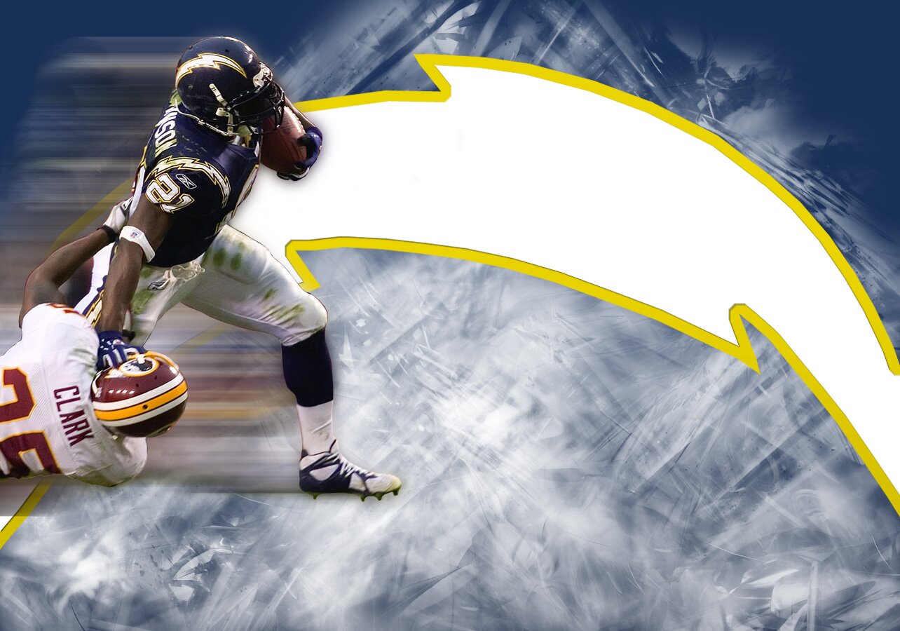
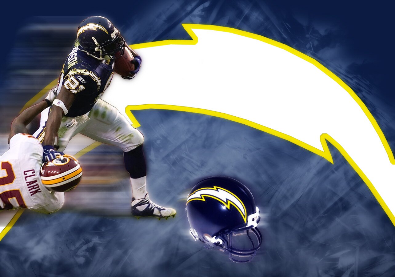
Next I just googled an image of the chargers lightning bolt logo, cut it out, and pasted it into my background, just above my gradient layer. Then I created a new layer under the lightning, and above the gradient, and brushed some abstract white onto it. I also lowered the opacity to 45%. This wasn’t necessary, but the bottom was looking a bit empty. So I googled a Chargers helmet, cut it out, and pasted it into the background. I applied the same blurs as above, but instead of 400 distance on the motion blur, I used about 80.
Press CTRL+A to select all. Then go to Edit > Copy Merged, and paste this copied piece above all your other layers. Set the blending mode to ‘Overlay’, and go to Filter > Blur > Gaussian Blur at about 5px.
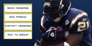
Step4: The Contact Table
Next up is the contact table.
Save this contact table template I have provided, and open it in Photoshop.
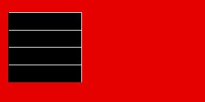
Create a New Layer, and fill with a gradient like you did for the background. Get your gradient tool, set your foreground color to #081735, and your background color to #193056. Then start your gradient at the top of the canvas, and drag it all the way down while holding shift to keep it strait. Paste your render for your contact table above your gradient layer, and try to position it to the right side because the buttons will be on the left side. Hide your gradient and render layers so you can see the template layer. using this contact table template, select your rectangular marquee tool and select each button one by one. Create a new layer for each button, and fill it with a color (in my case, I used the charger yellow ((#f4e736)). Now you should have 4 layers, for 4 buttons. Go to layer styles for one of the buttons, and apply these settings:
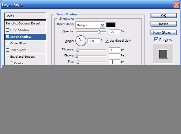
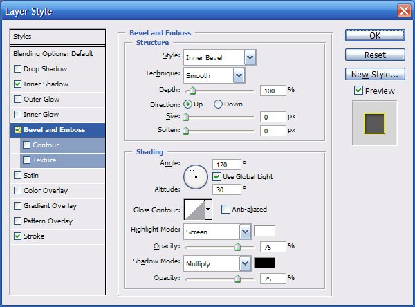
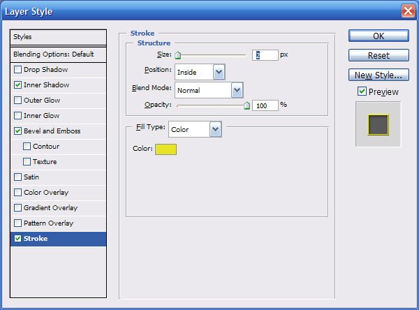
Right click on the layer that you applied the layer styles to, and copy layer styles. Then paste layer style onto the rest of the buttons, like below:
Step5: The Extended Network
Create a new document, 435×250 pixels.
You can do anything you want here, just keep it within the theme. But I didn’t do anything but paste an image into here.
Step 6: The Code
Now that we have our graphics, its time to set up our MySpace theme. We need to host our graphics. If you don’t already have a PhotoBucket account, I highly suggest you get one, great image host. Wherever you host your images, just get them hosted, and keep the url of each handy, we will need them in this next step. Using a MySpace code generator (one can be found here). Now you can do this however you like, but the important thing to remember is to stick with your color theme.