Living In The Clouds Book Cover
Create a complete book cover with this easy to understand tutorial. A preview can be seen below:

Step I:
1. Create a new document 6×9 INCHES. Remember to use inches when you are creating your document. It’s best to use inches when making something that you will be printing out for use in real life. For future reference, 1 inch is equal to 72 pixels.
2. Fill with a dark hue of the color you will be using. In my example, I used the color #62748D.
3. then go to Layer Styles and apply a Gradient Overlay with these settings:
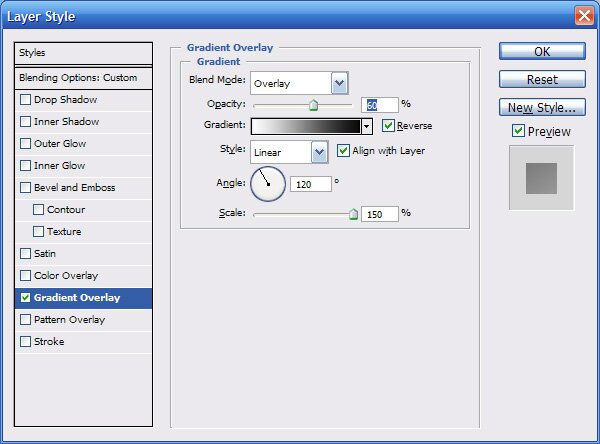
Next, create a small rounded piece at the bottom with these layer styles:

Step II:
Next we will be jumping into the creation of the background.
1. To start this, create a new document, 1000×1000 pixels.
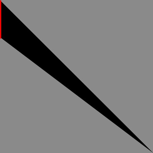
2. Get your Pen Tool, and make put a point at the bottom right corner, and another in the top right.
3. Make your next point about 250 pixels down.
Before you fill your first triangle, decide what color your overall document is going to be. In my example piece, I used the colors A5B5CB and C3CDDC. It’s important to choose your colors right now because it won’t be easy to change the colors. If you look at this picture, the red bar that I used as a temporary ‘ruler’. I just created a new document 10×250 pixels, filled it with red, and pasted it into the document we are using to make our background.
4. Fill this triangle with your light color.
In this image, you can see the above step illustrated.
After you make the first triangle, you can delete the ruler layer as we won’t need it anymore. While making this background, the key here is to have no spaces between triangles, nor have a triangle too short.
5. Duplicate your triangle, press CTRL+U to get into hue/saturation adjustment. Drag the Lightness slider all the way to the left to change this triangle to black. Now with your second triangle still selected, press CTRL+T (or go to EDIT>TRANSFORM>ROTATE) to start rotating your triangle.
As you get into the transform mode, there will be a circle in the middle. This circle is the axis at which the layer is rotated around. Drag this circle to the bottom right corner, so when you rotate the triangle, it will rotate around the corner. When doing this step, try to get the two triangles to line up perfectly without large overlaying. But a slight over lay is recommended because a space between these triangles will ruin the entire background.
6. Duplicate your first triangle again, and repeat the rotating step that you just did, and line it up with the black triangle.
7. Select the black triangle layer, and repeat the rotating step again.
As you can see, this black triangle is just a spacer for the real triangles. Keep repeating this until you fill the bottom/left portion.
8. Create a new ruler for use with the top portion (250 pixels wide). With your Pen Tool again, create a new triangle like you did in the start of this background. It’s fine to use the same black triangle as a spacer for the top/right portion here. Just repeat what you have been doing until you fill the whole thing.
After you’re done, you can delete the black spacer. Merge all your real triangles together, copy them, and paste into the 6×9 inch document.
8. Now you will see that the background layer is somewhat large. Press CTRL+T to enter the transformation mode, and while holding shift, resize the background until it fits.
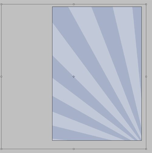
What I did to mine was move the background layer so that it is off the canvas in the bottom right corner. This way, it doesn’t show the convergence of the triangles into that one point.
So far we have this:

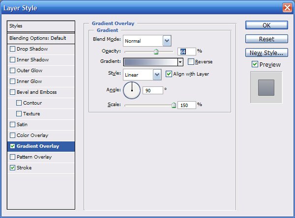
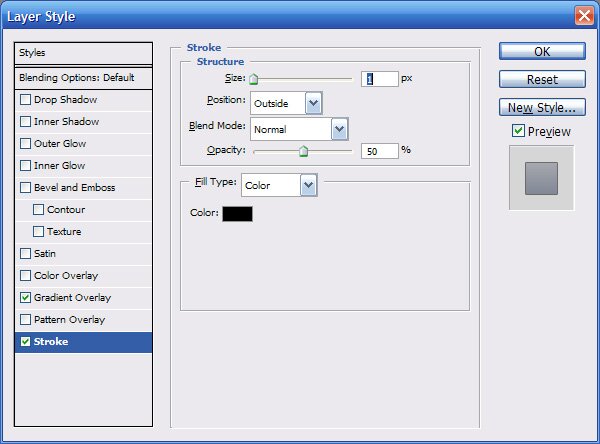
Go to Layer Styles, and apply a Gradient to the rays layer with these settings:
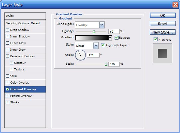
And set the opacity to about 40%.
That’s it for the background!
Step III:
Next, we will start making the clouds.
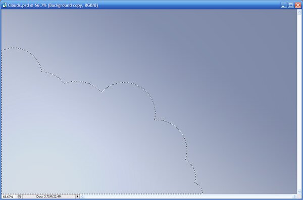
1. create a New layer UNDER the rays layer. With your elliptical marquee tool, hold shift and make fairly large circles. This first layer of clouds will be the back layer, so start the clouds higher, leaving room for the middle and front layers; like so:
2. fill this layer with your light color.
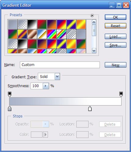
Go to Layer Styles and apply a gradient overlay with these settings:
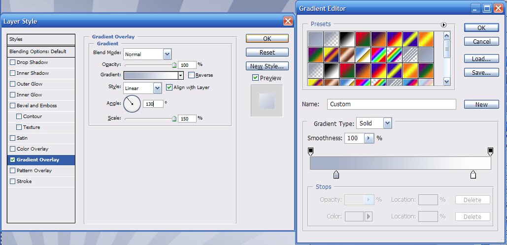
Click on the gradient to get into the window where you can modify the gradient.
You will have to play around with the angle to get what is best for your clouds. You will want to be aiming for the gradient to be even with your clouds. If you refer to the next image, you will see that my white is even across the edge of the clouds.
3. Repeat the previous step, but make the clouds lower than before. Repeat for a third time to make your final cloud layer.
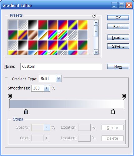
4. when applying the gradient, you will have to adjust the gradient sliders. Here is my settings that I used for each cloud layer:
Back cloud layer

middle cloud layer
front cloud layer
You should have this by now:

Step IV:
We are almost done, time for the text.
For my cover, I will be using the text “Living in the Clouds”. When putting your text in, give each word its own text layer, its easier to position the words this way. You can choose to position your text any way you like, but to give you an idea, here is how I positioned my text:

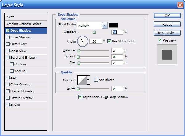
Under Layer Styles, I also applied a small drop shadow for a subtle effect with these settings:
In case you liked the font I used, it is called AardvarkBold