Create a Slick Business Logo
Some basic techinques on how to make a simple textual logo look appealing to the eye.
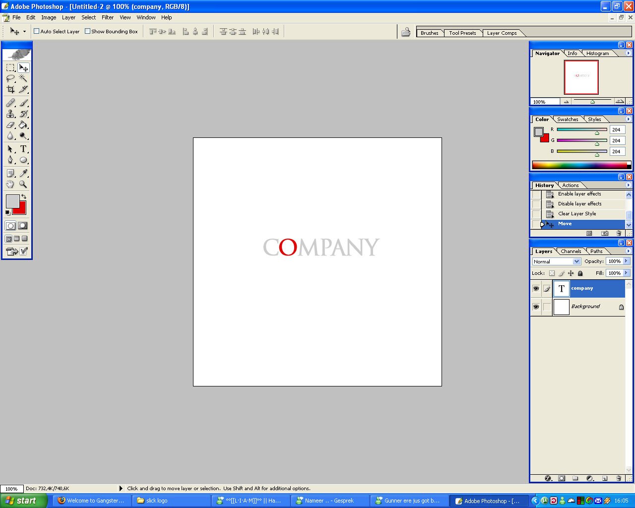
Here’s a result we will try to achieve:

1) Create a new canvas, not too big, I used 500*500, and use the type tool to put the text on.
I used trajan pro, using a nice light gray color. To make the end result even better, I also made one letter stand out, by making it red.
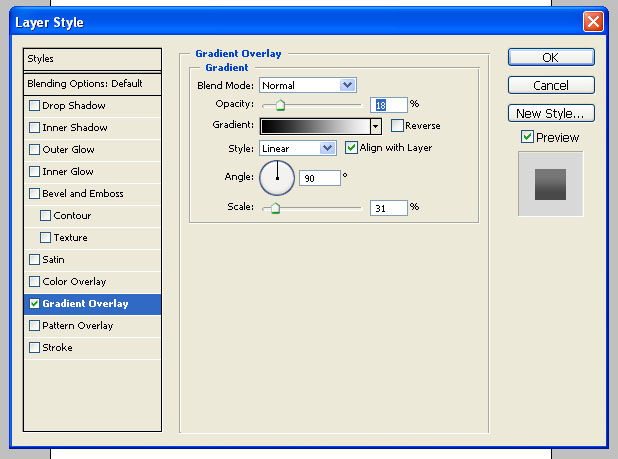
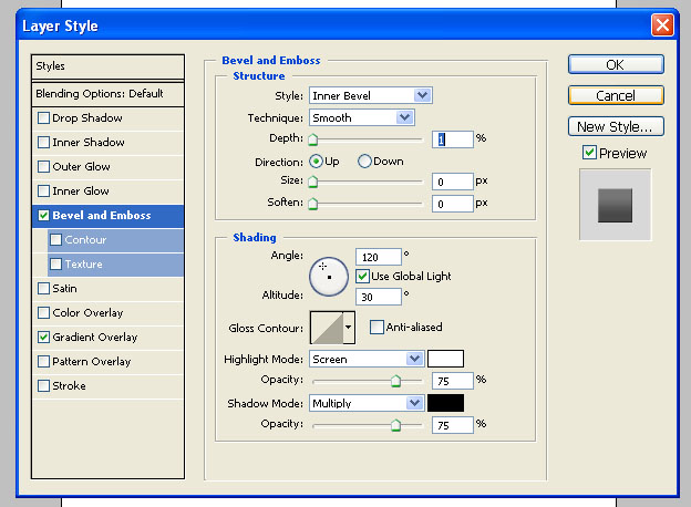
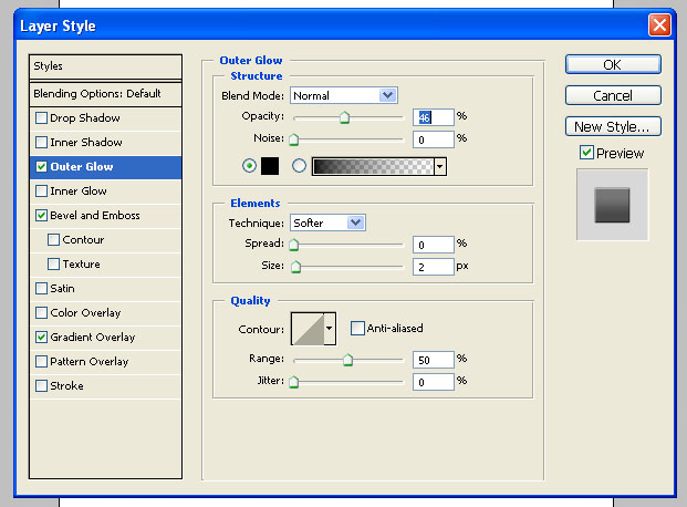
2) Now you have the basic text setup, apply the following layer options:
3) Duplicate the text layer, and free transform it.
Now, right-click on the text, and select “Flip vertical”, as shown below:

4) Move the duplicated layer down a bit, so you do not have an overlap and the two layers do not touch each other.

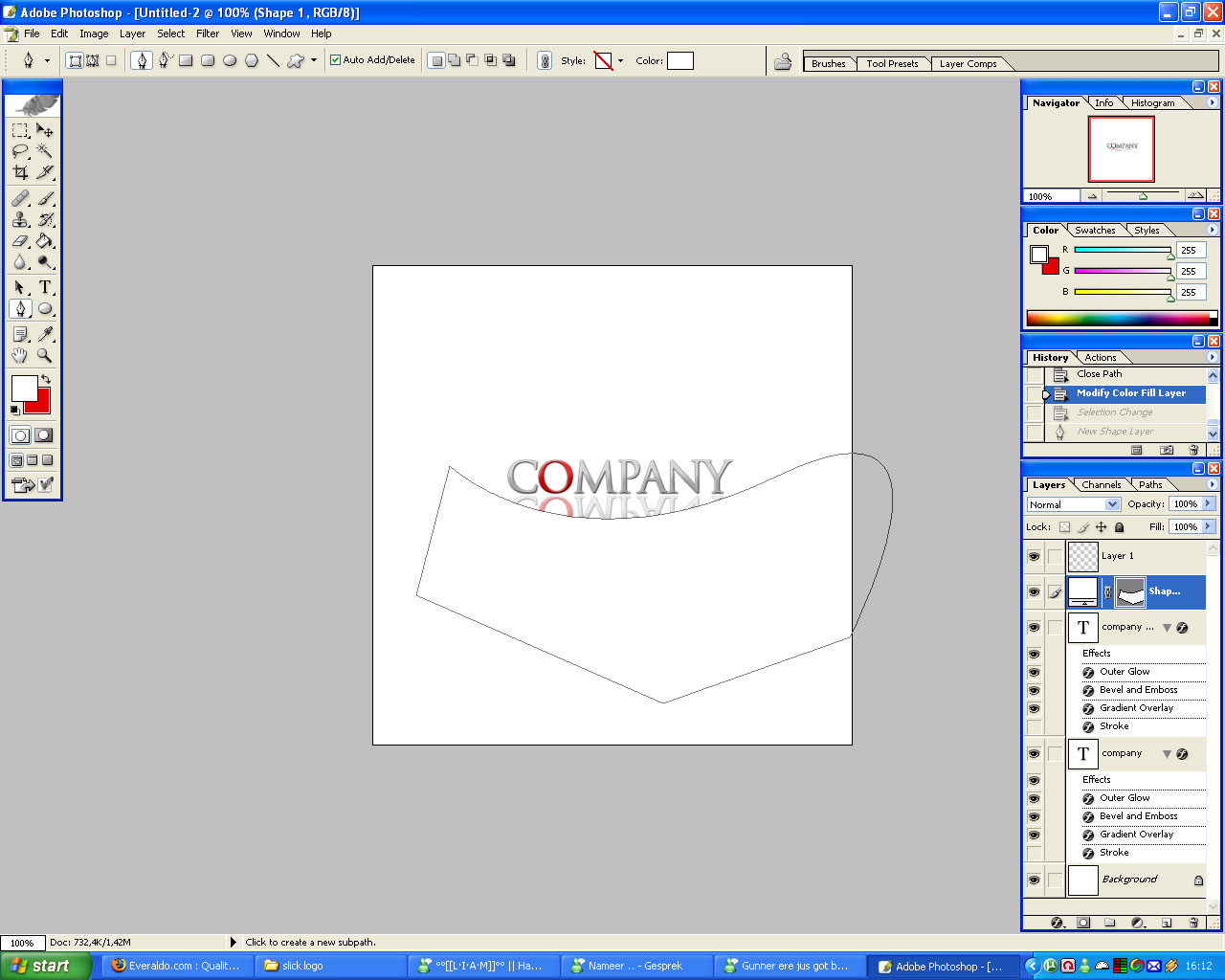
5) Create a new layer above all, and select the Pen tool.
Using the Pen tool, create a shape like shown below, only the top part is important, so dont be pickish about the bottom.
6) Right click the shape, and select “Make selection”.
Use the settings as shown below:

7) Delete the layer containing the shape, but do not deselect your current selection yet.
Create a new layer, and fill the selection with your backgroundcolor using the Paint bucket tool.
Move the result a bit, untill you are satisfied with the result.
This is what i got:

8) Create a new layer above the previous layer, and create a straight line through the text using the Pen tool.
This is done by holding shift while making the shape.
When the line is done, just do the same as before, create a large shape above, so you actually have the text half-visible, because the top half is covered by the shape.

9) Repeat step 6 & 7, but choose a bit higher value when you do the make selection.
Move the white/background-colored parts around untill you are 100% satisfied.
10) Your done, thats it!