Creating a Retro Logo
Hi all, and welcome! In this tuturial I will try to show you how I normally make my pics look retro!
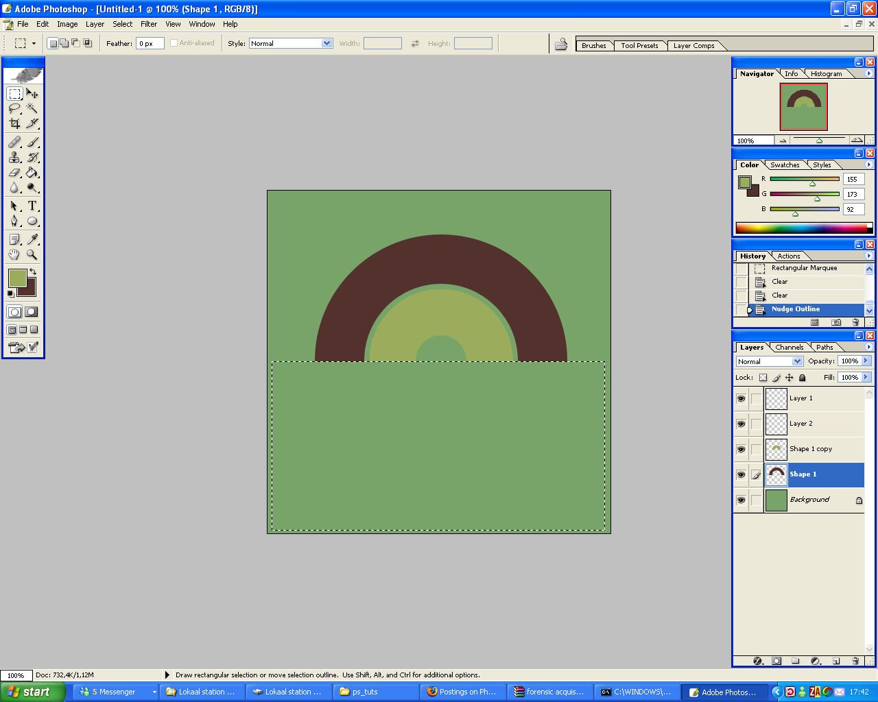
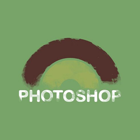
This’s a logo we will try to draw here:

I assume you have quite alot of photoshop knowledge, so I will not point out the obvious.
This tutorial is divided into 9 (pretty big) steps, so lets kick off with number one!
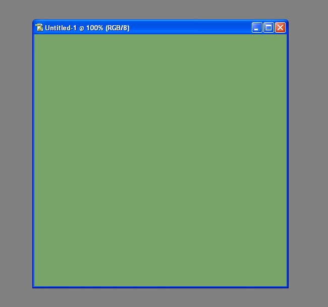
1) Create a new canvas, not too big, not too small,I picked 500*500. Fill the background with a nice retro-greenish color.
For me, the main element in retro colors, are the usage of very desaturated colors. (see the next step for more info)
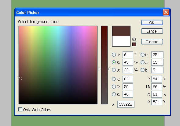
2) In this step I am going to show you how I normally pick colors.
Open the color picker, select a nice color the normal way, then press the “() S” button, this is the saturation box, for making colors look, well, less saturated.
I normally drag that down to about 40/30 %, but it heavily depends on the color you picked before.
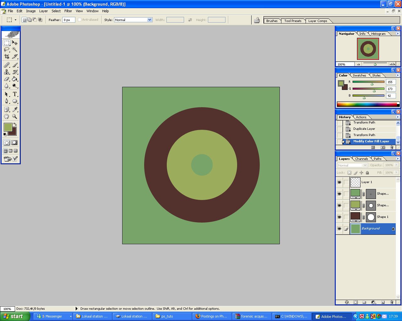
3) Select 2 colors the way I described above, making it your primary and secondary color.
Now, select the pen tool, and click that circle in the top-window. now make a circle in the middel of the canvas, by holding shift while dragging. Move the circle around a bit, untill it is centered.
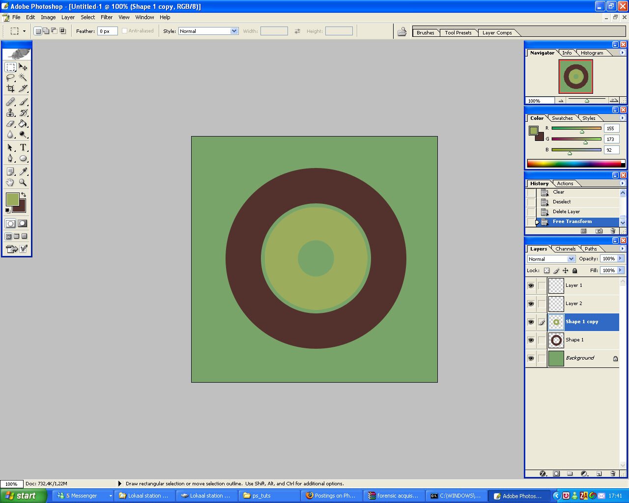
Duplicate the shape-layer and select the selection tool. Free transform the path, by right clicking the shape and selecting free transform.
Now, hold down shift and alt, and size the new circle down to about 2/3rd of the original size.
Double click the fill color in the layer pallete, so you can change the color of the shape.
Set it to the other color you picked earlier.
Repeat this step, so you have 3 circles, but give the inner circle the same color as you gave the background.
You will now have something that looks like a wheel or something.
4) Now, rasterize all layers, and control-click the top layer, so you select its contents.
Click on the layer with the secondly created circle on it, and press delete.
Control click on the secondly created layer, so you select its remains.
Now, activate the first circle-layer, and press delete again.
You will now have exactly the same as last step..if all went well.
5) Delete the smallest circle-layer, it has now become useless, scale the small circle down a bit, while holding shift and alt.
You will now see a small crease within the two circles, dont overdo this, a few pixels will do.
6) Pick the select tool, and delete the bottom half of both circles, to make it become a nice double-arch.
If everything went well, it will look like this:
7) Now, we have an arch, but it still looks a bit dull, dont you think ?
Let’s add some text! I chose arial rounded as a font, because its plain and simple, and it really adds to the retro-feel.
However, if you compare my text to the standard arial font, you will notice some difference.
Go to Window -> Character and set the letter spacing to -40/-60, whatever you like.
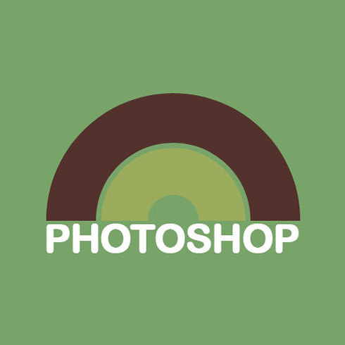
8) For now, it starts to look like something already, but, there are a few things missing.
The archs and the text are looking waaay too basic, so lets make them look more interesting!
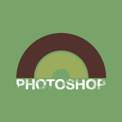
You can do this by grabbing your favourite brushes (grunge works well, I used some paint brushes I found on DeviantArt) and start brushing on a new layer, using the backroung color.
This will prevent you screwing the entire image, and having to start again, because the undo function didn’t cover it.
I would recommend doing this layer-per layer, starting with the text, just get wild, but dont overdo it!
Then make a new layer again clean the parts of the image you do not want to be covered yet, and repeat.
If this is just a bit too quick for you, just look at my progress, all the “decoration” is done on seperate layers.
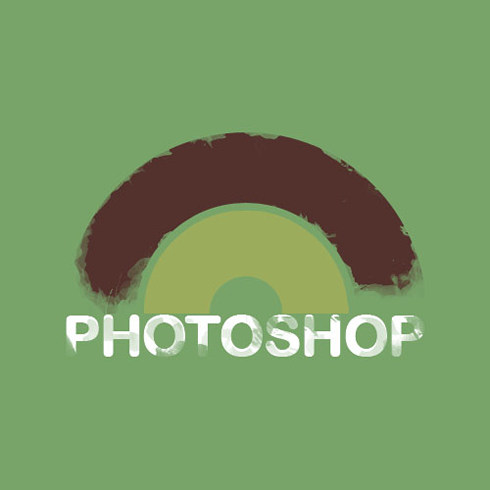
9) Great! It actually looks like a retro image, right ? To create just a bit more detail, I have used a very powerfull filter in photoshop. duplicate the archs layers, then go to Filter -> Pixelate -> Color halftone, use these settings:
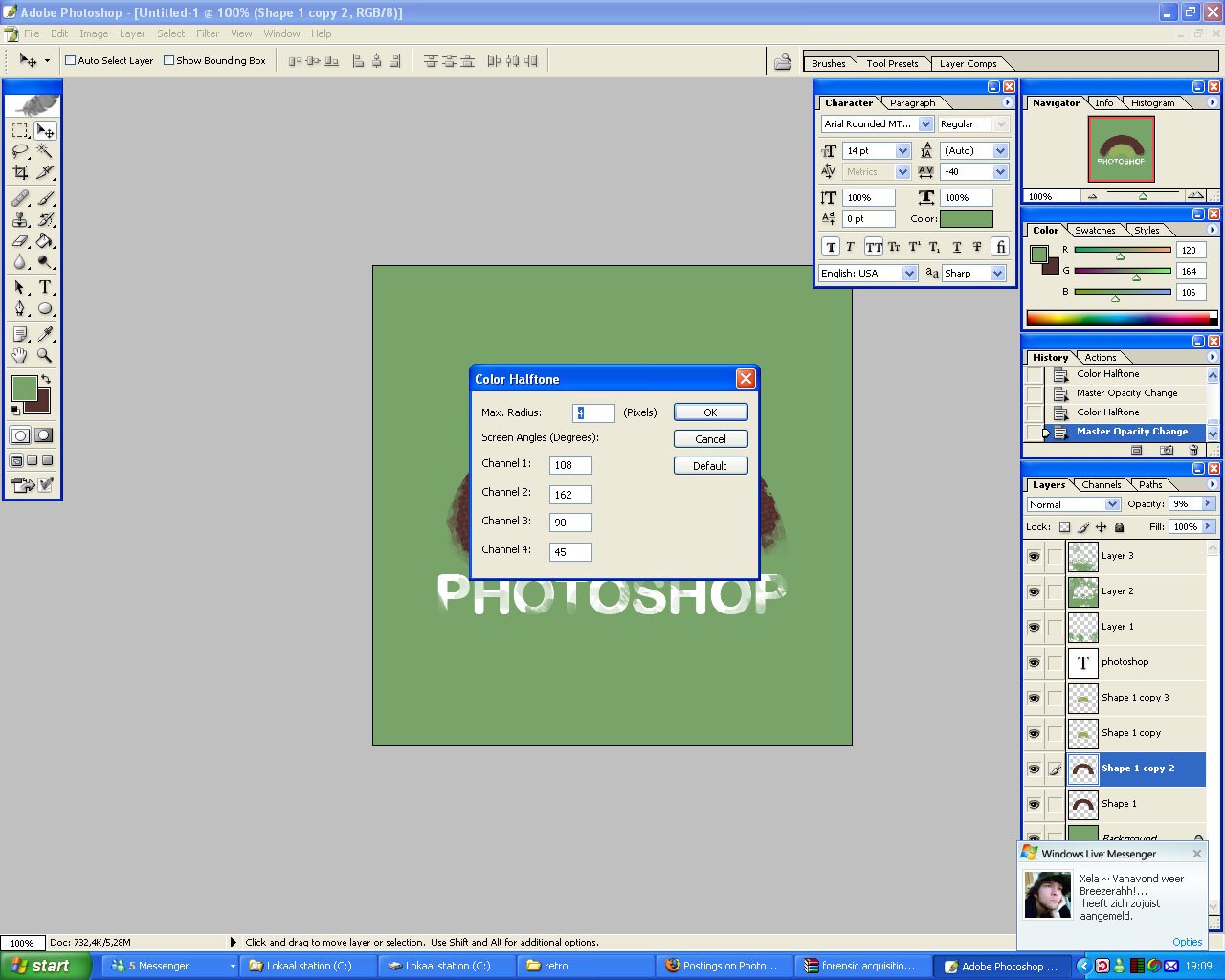
You will see the archs getting covered with spots completely.. we dont want that, its just ment as some sort of texture, so lower the layers opacity to about 9-10%.
10) Just try the various effects i described above, most of them are pretty easy, but, if used right, you can create stunning results!